.png)


The reasons behind our refresh
We believe all businesses should strive to evolve and grow; as the old saying goes “stagnation is the enemy of progress”. We are keen to ensure our brand remains relevant and aligned with our ever-evolving vision and goals, whilst keeping up with changing market dynamics, trends and customer preferences.
By leveraging new technologies and design approaches, we hope you’ll agree that we’ve created a modern and engaging website, with improved user experience. Of course, it’s also a great platform for showcasing our new brand and for demonstrating our commitment to innovation.
Our new logo
There are two elements to our Ministry of Fish logo – the fish icon and the wordmark. Initially, we were unsure about a change to the fish – mainly because Jane has it as a tattoo! Of course, Jane is as passionate about staying fresh as the rest of us and so we were given the green light.
Our new fish has evolved from the old… the lines are less uniform, reflecting the style of our wordmark; the new crown has been designed with less detail, making it more suitable for small scale use - particularly in digital applications; and the fish now sits at a dynamic angle – swimming forward as opposed to sitting still!
Our wordmark required less change, but we have better aligned it with our fish…we’ve thickened the lines, tightened the kerning and changed the i dots from squares to circles. Check out our journey to the new below.


New us, new website
Our previous website was fun and received some lovely feedback over the years, but with new branding and growing capabilities, it was time to move things onwards and outwards - expanding from the single page style previously adopted.
From a design perspective, brand consistency is vital! From a user experience, making the site engaging and intuitive, whilst also showing off our personality - and not forgetting our skill sets (did we mention we did this all in house?) – is key.
Quirkiness is also important to us – our old site had it and the new one doesn’t let us down! We love the use of fun, interesting, fonts and funky illustrations to complement our copy. We also want our audience to be engaged and believe we’ve taken that a step further on our new site – through the use of video, animated illustrations and hidden easter eggs around the site… have you found them all yet?

The build
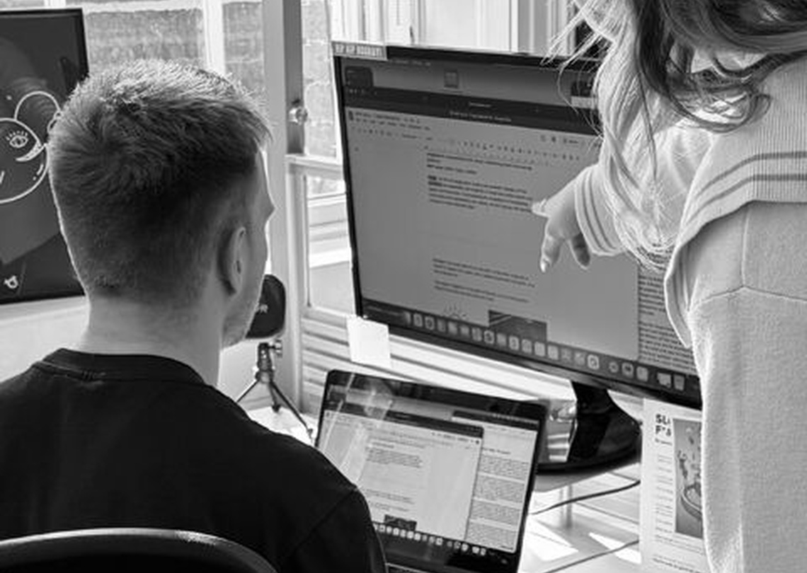
Our previous website was built on WordPress and we considered this again, but eventually opted to use Webflow. Why? We feel that Webflow offers enhanced design flexibility, with less development and coding - ultimately allowing for a more customised and unique website design. This flexibility has been crucial in aligning our new site with our new brand identity and desired user experience.
Additionally, the simplified development process in Webflow - thanks to its user-friendly interface and intuitive tools - makes building and maintaining the website easier and more efficient. The integrated design and development workflow also eliminates the need for third-party plugins or integrations – helping to simplify the overall management process and making it a more cost effective solution. Finally, Webflow offers a scalable infrastructure and robust features, which will accommodate our future growth and expanding needs.
What now?
We’re busy applying our new branding to EVERYTHING - did we mention consistency is key?! This includes our internal communications, office decoration and of course our socials… are you following us yet?
Whilst we’re busy covering all bases, why don’t you continue to explore our website (check out our Services page for those hidden easter eggs!), admire our new branding and see if there’s anything we can help you with… Maybe you’re considering your own brand refresh or website design? Give us a call if so, we’d love to help spruce things up for you!
.png)


.png)
